Feeling is Believing: The Ultimate Guide to Communicating AI Confidence with Visual and Haptic Cues
Ever used an AI tool and just gotten a… weird vibe? Sometimes, an AI-generated answer feels rock-solid and confident. Other times, it feels like a hesitant guess, even if the text on the screen looks the same. That unspoken feeling—that vibe—isn't magic. It's a product of design, and more often than not, a product of unintentional design.
What if we could design that feeling on purpose?
Welcome to the world of communicating AI confidence. It’s about moving beyond just displaying data and starting to design for intuition. By using a thoughtful language of visual cues and haptic feedback, we can create AI interactions that feel less like a black box and more like a conversation with a trusted partner. This guide will walk you through the psychology, the patterns, and the pioneering techniques—including the missing chapter on haptic feedback—to help you build AI that doesn't just inform, but also instills confidence.
What is AI Confidence (and What It Isn't)?
Before we dive into design patterns, let's clear up a crucial concept. When we talk about "AI confidence," we're referring to a confidence score. This is a value, usually between 0% and 100%, that represents how certain the model is about its own output.
Think of it like a weather forecast. When the meteorologist says there's a "90% chance of rain," they're not saying it will rain 90% of the day. They're expressing a high degree of confidence that rain will occur. An AI confidence score works the same way; it’s the model’s self-reported certainty in its prediction.
Here’s the most important takeaway:Confidence is not the same as accuracy.
An AI can be 99% confident and still be 100% wrong. This happens when a model is "miscalibrated"—its internal sense of certainty doesn't match its real-world performance. That’s why our job as designers and developers isn’t just to display a number, but to create an intuitive system that helps users understand the AI's state of mind and make their own informed judgment.
The Visual Language of Certainty
Our eyes are incredible at picking up subtle cues. We can use this to our advantage by creating a rich visual vocabulary that communicates AI confidence at a glance. Research from academic journals like Frontiers in Neuroscience shows that how we present this information significantly impacts user trust and decision-making.
Here are some core patterns for translating confidence scores into an intuitive visual language.
Color and Opacity
Color is a powerful, immediate conveyor of meaning. We can use it to create a quick sense of the AI's certainty level.
- Do: Use a gradient or a spectrum of a single color (e.g., shades of blue or green) to represent the range from low to high confidence. A more saturated, solid color signals high confidence, while a faded, less opaque color suggests uncertainty.
- Don't: Use red for low confidence. Red is universally associated with errors, warnings, or stopping. Low confidence isn't an error; it's simply a statement of uncertainty. Using red can cause users to wrongly reject a potentially useful (though uncertain) suggestion.
Shape and Morphology
The form of an element can communicate stability or instability.
- Do: Use sharp, solid, and stable shapes for high-confidence outputs. For lower confidence, use softer, blurred, or even "shimmering" or "breathing" animated effects. This visually mimics the idea of something coming into focus as certainty increases.
- Don't: Make low-confidence outputs completely unreadable. The goal is to signal uncertainty, not to frustrate the user. The content should still be accessible, with the visual cues acting as an added layer of information.
Adjacency and Annotation
Where you place confidence information matters. The Frontiers study found that placing confidence indicators directly adjacent to the AI's output helps users integrate the information more effectively.
- Do: Use clear, simple annotations like "Highly likely" or "Our suggestion" next to the output. You can pair this with a simple confidence bar or dot. This is far more digestible than a raw percentage like "94.7% confident."
- Don't: Bury the confidence score in a menu or require a hover to see it. It should be an integral, visible part of the AI-generated content.
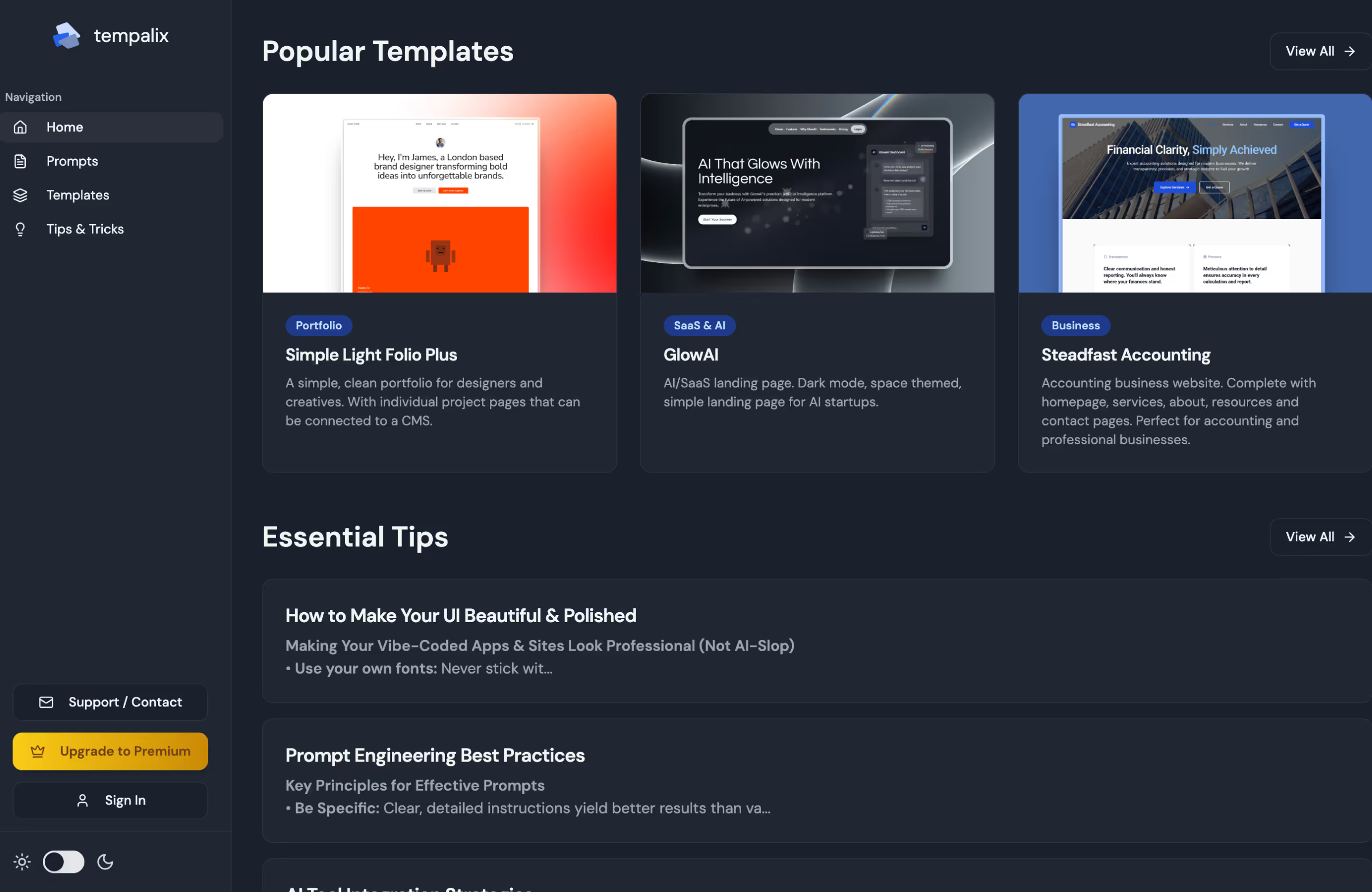
Seeing these patterns in action is key. You can discover, remix, and draw inspiration from various projects, many of which are pioneering these intuitive user interfaces.
The Missing Chapter: A Haptic Language for AI Confidence
Here’s where we enter new territory. While visual cues are well-discussed, the use of touch—haptic feedback—is a massive, untapped opportunity for creating truly "vibe-coded" experiences. Most UX pattern libraries are completely silent on this.
Imagine your phone giving you subtle physical feedback that reflects the AI's certainty. This moves communication from the screen into your hand, creating a deeper, more embodied sense of understanding.
Here is a simple framework for a haptic language:
High Confidence: The Sharp Tap
When the AI is highly confident (e.g., >90%), the feedback should reflect certainty and finality.
- Pattern: A single, crisp, sharp tap. Like a definitive period at the end of a sentence.
- Why it Works: This haptic event is short, clean, and unambiguous. It feels precise and confident, reinforcing the strength of the AI's output.
Medium Confidence: The Rhythmic Pulse
For medium confidence levels (e.g., 40-90%), the feedback should feel more considered, less absolute.
- Pattern: A quick double- or triple-pulse. A gentle "ba-dump" or "ba-da-dump."
- Why it Works: The rhythmic pattern mimics a moment of thought or consideration. It’s not as final as the single tap, introducing a subtle hint of "here's what I think, but you should check."
Low Confidence: The Fading Rumble
When confidence is low (e.g., <40%), the feedback should convey hesitation and diffusion.
- Pattern: A soft, low-frequency rumble that gently fades out over a second.
- Why it Works: This pattern lacks a sharp edge. It feels diffuse and uncertain, like an idea that hasn't fully formed. It intuitively tells the user, "This is just a guess, handle with care."
By integrating this haptic language, you are truly creating AI-assisted, vibe-coded products. You're designing for a feeling, allowing users to understand the AI's state not just by reading, but by sensing.
Mastery: Building Trust and Handling Uncertainty Gracefully
Ultimately, all these cues serve a single, crucial purpose: building justified user trust. As explained beautifully in Smashing Magazine, trust in AI isn't a single metric; it's a psychological construct built on four pillars. Our design choices can reinforce each one.
- Ability: Does the AI have the skill to do its job? By clearly and honestly communicating its confidence, the AI demonstrates self-awareness, which enhances its perceived ability.
- Benevolence: Does the AI have my best interests at heart? When an AI admits uncertainty (e.g., with a fading haptic rumble), it shows it's trying to prevent the user from making a mistake. This feels helpful, not arrogant.
- Integrity: Is the AI honest and principled? Consistently and accurately representing its confidence, good or bad, builds a sense of integrity over time.
- Predictability: Does the AI act in a way I expect? A consistent visual and haptic language makes the AI's behavior predictable, reducing user anxiety and cognitive load.
Common Mistake Callout: Be wary of false precision. Displaying a confidence score as "97.3%" might seem transparent, but it implies a level of accuracy that is often misleading. Grouping scores into clear, understandable categories like "High," "Medium," and "Low" (or "Confident," "Unsure," "Guess") is far more effective for user comprehension.
Your Playbook for Intuitive AI
Ready to implement these ideas? Here's a simple playbook to get your team started.
- Define Your Tiers: Don't just pass the raw percentage to the UI. Decide on 3-5 confidence tiers that make sense for your application (e.g., Very High, High, Medium, Low).
- Design a Multi-Modal Language: For each tier, define a corresponding visual cue (color, shape, annotation) and a haptic pattern. Document this so it can be applied consistently.
- Prioritize Clarity Over Data: Always ask: "What do I want my user to do with this information?" The goal is to guide their judgment, not just to show them a number.
- Design for the Edge Cases: What happens when the AI is 0% confident? Or when its confidence is consistently low? Design clear fallbacks and messages that guide the user gracefully, such as "I'm not sure about this, perhaps you could try rephrasing?"
- Test with Real Users: The ultimate test is whether these cues actually help users. Run usability tests to see if your new visual and haptic language makes the AI feel more transparent, trustworthy, and intuitive.
By moving beyond the defaults, you can join a community of creators building the next generation of AI tools—ones that feel less like machines and more like capable, trustworthy partners.
Frequently Asked Questions (FAQ)
What is an AI confidence score?
It’s a numerical value (usually 0-100%) that indicates how certain an AI model is about its own prediction or output. It is a measure of the model's internal self-assessment.
What's the difference between AI confidence and accuracy?
Confidence is the AI's belief that it is correct. Accuracy is whether it is actually correct based on real-world data. A model can be very confident but completely wrong, especially if it encounters a situation it wasn't trained for.
Why shouldn't I just show the exact percentage?
Showing a score like "84.2%" implies a level of precision that is often not meaningful to the user and can be misleading. Grouping scores into human-understandable categories (e.g., "Confident," "Unsure") paired with intuitive visual cues is typically more effective for decision-making.
Can I combine visual and haptic feedback?
Absolutely! In fact, they work best together. A multi-modal approach (using sight, sound, and touch) creates a richer, more robust communication channel that reinforces the message and makes the experience feel more integrated and intuitive.
As this field evolves, the most inspiring work will come from those who blend technical capability with a deep understanding of human psychology. To see what's possible, explore our repository where developers and enthusiasts can discover, share, and build upon the most creative AI-assisted applications.
.svg)


